Aim
The purpose of gathering user requirements was to ensure that the development of the mobile search resulted in a user-friendly interface with functionality that would make it useful and attractive to OU students and staff.
Method
Members of Open University staff were invited to participate in the user requirements study via notices on the OU intranet and via a Mobile Technologies Special Interest Group (M-Tech SIG). All participants would be entered into a prize draw for one of ten Amazon vouchers. See Appendix 1 for the wording of the invitation. The project manager recruited some academic staff, and some non-academic staff who are current OU students. The participants were asked to use the mobile search interface for any library searches they needed to do during January 2012. They were asked to send us feedback as soon as they completed a search, telling us what the experience was like and what they would want to be able to do with a mobile search tool.
In order to prompt participants to record their experiences we provided a feedback form linked from the mobile search results page. As users had to be logged in to use the search tool we were able to fill in their name and the date and time for them, so all they had to do was tell us where they undertook their search, how they found the experience and what sort of functionality they would like on the search page and results page.
Participants were asked to use their own mobile phones or small tablets where possible, but were offered the opportunity to borrow a mobile device if they didn’t have a suitable one.
Unfortunately the site’s device detection failed during the study so mobile users were finding themselves on the desktop site rather than the mobile version of the site.
To test new developments on the search interface we also held a focus group on 27 February. We invited all 15 of our volunteer participants, but only two attended.
Participants
The initial response to the invitation via the intranet and mailing list led to 16 staff volunteering to take part. One later dropped out due to going on study leave. Of the remaining 15 only six participants actually gave us feedback on the mobile search interface.
| Participant type | F | M | Total |
| Academic | 1 | 3 | 4 |
| Student | 4 | 4 | 8 |
| Tutor | 2 | 2 | |
| Research student | 1 | 1 | |
| Total | 5 | 10 | 15 |
The participants represented a range of subject areas such as Arts, Business, Classical Studies, Earth Sciences, Educational Technology and Languages.
Results
Five participants completed the feedback form, and left the following comments (supplied verbatim, without corrections):
Student: Using my smartphone, I have accessed library resources during “empty time” as I like to think of them – e.g. if the girlfriend is in a shop while I wait outside; while waiting for a bus/other queue; while on a bus if I have an audio resource. I have a HTC Desire with Android. The search screen fits well, and the option to view a page (where available) is very useful when I do not wish to download a large (2MB+) PDF. The search refinement is OK but the drag bars can be tricky to use on a smallish screen when non-mouse controlled.
Research student: It was excellent. I managed to download PDfs from ScienceDirect and lots of the options I have from PC are there from mobile as well. If using wi fi, it’d even be fatser and better than the network’s internet especially if the signal or coverage not that good.
Tutor: very smooth I had no problems
Academic: I was not automatically directed to the mobile site. My username and password were not accepted. I didn’t get an error message, I just kept being redirected to enter my user name or password. So I was unable to read any of the articles.
The “search refinements” and “drag bars” referred to by the student are part of the EBSCO Discovery Service desktop site, and not part of the mobile search interface. The prototype search used for this study did not link to EBSCO’s mobile optimised interfaces if participants left the library website.
The problem with signing in experienced by the academic is likely to have been due to the difficulty with entering the complex alpha numeric passwords via small touchscreen keypads. One of the aims of the MACON project is to investigate a solution to make authentication via mobile devices easier.
Participants were asked to indicate how long they had spend on the mobile search interface during a single search session. Their responses indicate they either spent 2 to 5 minutes or 10 to 30 minutes searching. This seems to indicate that at 40% of them were willing to persist with their search despite the limitations of small screen.
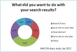
 The project team also considered it important to ascertain how users might want to interact with their results once they had performed a search. We were aware that some participants were likely to be reluctant to read the full text of an article or ebook on a small screen, so we wanted to know what they would do with their results instead. Participants were given a multiple choice question about this in the feedback form and could select as many options as they wanted to.
MACON focus group, 27 February 2012
The focus group consisted of two participants who were also part of the project’s diary study. The devices used by the participants were an HTC Desire and a Nokia N900.
Impressions of interface
| Notes | Action |
| Nokia N900 is mostly used in landscape mode and the smartphone homepage icons don’t reflow | Consider allowing icons to reflow |
| Placement of navigation icons in relation to search box makes them look related to the search. Participants suggested moving the search box below the “Search” heading to separate these elements. Also provide text under icons. | Move “Search” heading above search box and try text under icons |
| One participant asked if it’s really necessary to have the helpdesk hours and helpdesk contact details separately. Suggested combining them under the headset icon. | Combine helpdesk hours into “Help & Support” page |
Search results interface
| Notes | Action |
| Both participants liked the buttons in the search results and didn’t feel the item title needed to be a link | |
| Buttons not left aligned on Samsung | Check whether this relates to “mobile view” setting on Android browsers |
| One participant would prefer to be able to choose the number of results to show per page. | Investigate whether this option could be incorporated without crowding the screen too much |
| Participants would like to see total number of search results above page number navigation | Expose number of search results between search box and page number navigation |
| Participants would like help/tips on which Boolean limiters can be used in the search | Provide limiters as part of ‘Advanced search’ |
| It needs to be made clear what is being searched (i.e. articles & ebooks, not journal titles). | Provide suitable introduction on search page |
| One participant would like to be able to browse journal titles through the mobile interface | Not part of project – note for later development |
| Both participants would like the search terms to be highlighted in the search results list and in the abstract when viewed. | Highlight search terms within results. |
Accessing full text
| Notes | Action |
| Redirection errors experienced for some results – possibly those not on EBSCO | Test ‘get text and get PDF’ results to identify where this problem is occurring. |
| DOIs not resolving consistently to full text | Investigate DOI resolver |
| Participants perceived an error when tapping “Get text” led to “body text is not available” message. | Don’t show “get text” if full text not available in html or other non-PDF format. |
Native app
When asked the participant with the Android phone said that when the mobile search interface was first publicised he had expected it to be an app, and would normally expect an app for such a specific service, but both participants were quite happy with the web interface.
Conclusions
Methodology
A mobile-friendly feedback form may lead some participants to give very brief feedback.
User requirements
- Three of the five participants wanted to read the abstracts of items in their search results, four wanted to save their references so that they could read them or cite them later and only one wanted to read the full text.
- The mobile search interface should provide users with flexibility, and allow them to mark results to read or cite later on a different device.
- Participants didn’t mention authentication as being a particular barrier to a good search experience.


 M-Libraries Conference 2012