The ideas and comments which participants at the Innovations in Activity Data workshop scribbled so colourfully onto paper table cloths during the World Cafe activity have now been written up .
The images are as follows: (click on the image to see a full screen version of the image)
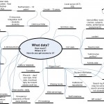
Diagram 1 from table 1: What data?
- What data have you access to?
- How much data – how many years?
- Where is it?
- How do you get access to it?
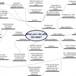
Diagram 2 from table 2: So I’ve collected this data what can I do with it?
- Make recommendations?
- Use for business intelligence?
- Share it?
- Your ideas about what you’d want to know
- Who could it be aimed at?
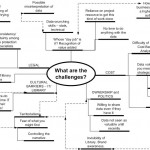
Diagram 3 from table 3: What are the challenges?
- Barriers to using it?
- Data protection? Legal?
- Skills? Time?
- What’s the value/benefit
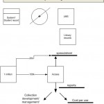
Diagram 4 is also from table 3. It is a sketch of Tony Hirst’s which didn’t quite fit and which I didn’t quite understand! I have drawn it exactly as he did (I think!).


